
She-Hulk Covers 💚✨
Issues 1-5 📚


When Marvel originally reached out to me about being the main cover artist for the new She-Hulk series, I was initially inclined to say no—not because I didn’t want to take on the gig, but mostly because I wasn’t sure I’d be able to do the character justice. I was also really overloaded with work at the time, so my first response was to politely decline due to schedule constraints.. to which the editorial team came back with a generous deadline extension and a great deal of patience with my inflexibility. 😲 Hard to say no to that!

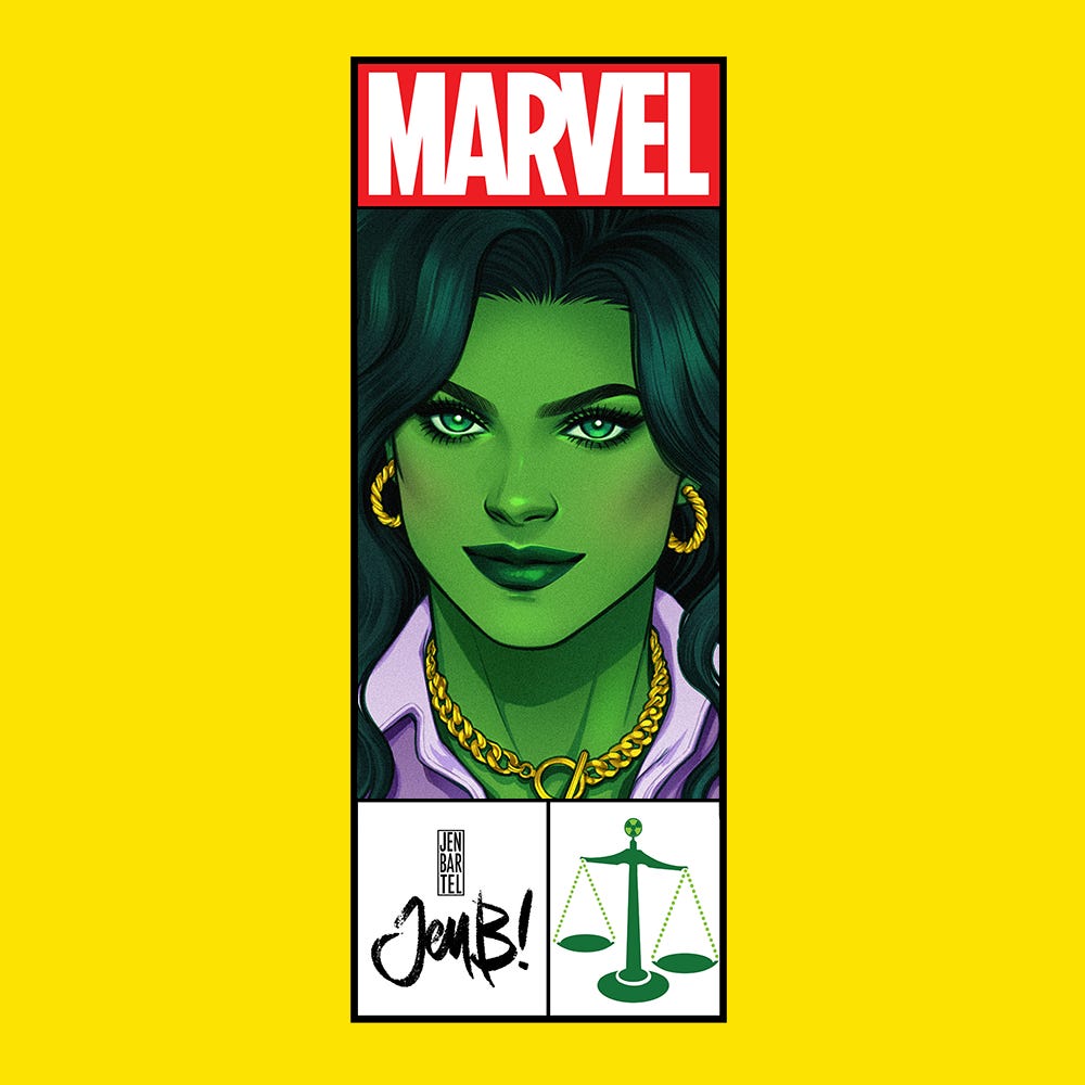
I was given full freedom with the direction I wanted to go with these, and after a quick discussion with Rainbow, who is a long-time Jennifer Walters fan and grew up reading Sensational She-Hulk, I knew I wanted to look to the original 80’s/90’s run by John Byrne for inspiration. His most famous covers from the series are already super compatible with my own artistic inclinations, as I tend to be drawn to bright, poppy colors and graphic mid-century style pinup art. In fact, I believe the reason why the team at Marvel wanted me to do these covers in the first place was because of this one I did as part of my Women’s History Month series from last year, which, ironically, was the first time I had actually drawn Jen Walters (outside of one commission I did at a convention a few years back):

I’ll probably do a separate post on these covers at some point, so without getting lost on a total tangent here, these covers were a real stylistic departure for me—although I’m not the most “inks-heavy” artist working in mainstream comics today, I do generally tend to avoid doing fully painted pieces (mostly because I’m a notorious noodler and over-renderer who struggles with leaving anything feeling “unfinished”) so in an effort to keep myself from doing that, I spent a lot of time studying the work of some of my all-time favorite pinup artists: Coby Whitmore, Andy Virgil, Jon Whitcomb, and Ren Wicks before doing these:

Some of these influences have stuck with me ever since, and I still try to channel the things I like about their work wherever I can. I also decided to add some visual interest and elevate these covers by doing a series of corner boxes featuring each character’s debut year (each of the characters on my Women’s History Month covers was painted dressed in attire from the era they were created in) which would carry forward on my She-Hulk covers. I don’t know about you, but corner boxes have always felt like such a cool “extra treat” to me—I loved looking at them as a kid and would love it if they made a full comeback.
Anyway, for the first round of concepts I submitted, I really took a lot of extra time to think through my choices—I knew that I’d want to carry out whatever precedents I set on the first cover on all the others in order to achieve a sense of visual consistency, so it felt like there was a lot riding on it.. Especially since I tend to be hired to do variant covers, which means I’m rarely having to think about my covers in a series, or even having to draw the same character multiple times. That’s why these are all way more rendered out than what I would normally send in—a big part of it was me simply trying to figure out how I’d draw her and attempting to develop some level of muscle memory so I’d be able to keep things cohesive.

To my surprise, Marvel came back with a greenlight for both options A and B; that doesn’t tend to happen to me (again, usually I’m just contributing a single variant cover to a series and not coming onboard as the main cover artist) so I was thrilled to move forward with both. Originally, A was meant to be used as the cover for issue #1, but they decided to go with B later on. (That’s why if you’ve been following solicitations and social media posts, you may have seen some mis-numbering on these two covers.


For issue #3, I was informed that Jack of Hearts 🂫 would be making a comeback, and as a potential romantic interest for Jen no less..! So I wanted to go with something sweet that would also highlight their height difference 😂💖
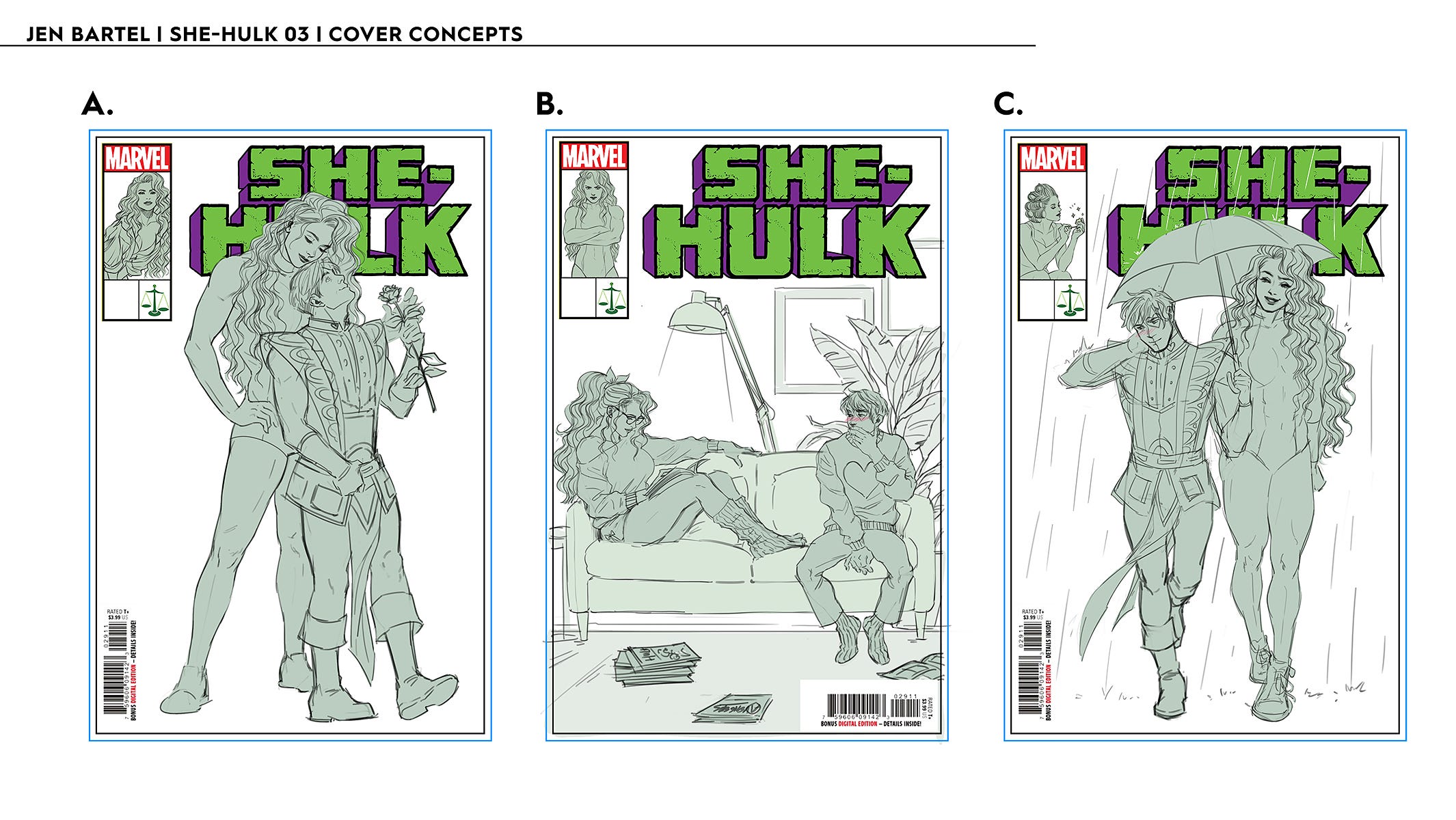
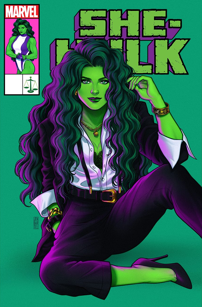
They went with option C, but requested I make their height difference even more pronounced (like I did in option A), and they chose the corner box from A as well. Here’s how the final art turned out:

I don’t always know what’s going to happen in each issue, so for issue #4, I gave a range of options featuring different characters that might make an appearance. By the time I was ready to get started on the final art for this one, the decision had been made—Ben Grimm, aka The Thing would be making an appearance! Another character I’d only drawn on one other occasion, funnily enough. They did request that the corner box feature Jen in a suit—which I’d never complain about. 🤩 Love drawing her in lawyer-wear.


For issue #5, they actually wanted me to consider taking one of my previously submitted concepts to final—the closeup of her face from way back when I sent in my first set, and option B from the last round. I also thought I’d offer a third option, another business attire pinup that I thought might look stronger sitting on a shelf. That’s the one they went with:


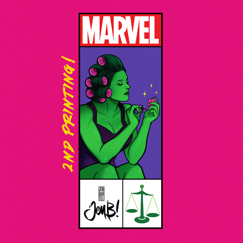
Since the release of this book, both issue #1 and #2 have sold out—I can’t thank fans enough for preordering and supporting it! As soon as I heard that #1 would be going back to the printers, I whipped up a new version of my cover, featuring Jen in the same outfit Byrne drew her in for the 2nd printing of Sensational She-Hulk #1:

..and for #2, I gave Jen’s business look a ✧ dark ✧ color scheme, and finished out the one of the corner box sketches I had submitted for issue 3 that the team liked but ultimately didn’t get selected back then:

Thank you for reading all the way to the end of this (extremely) long post—when I originally agreed to come on board to do these covers, I thought I’d be doing 5 of them, but because of all of the excitement that the series has managed to generate, it’s now looking like I’ll be doing way more than that..! Here’s to the next post 🥂✨

I love the corner boxes and also have fond memories of looking at them as a kid. One of my favorites was New Warriors #39 which has Namorita and Nova kissing on the cover while the rest of the team reacts from double corner boxes.
Thanks for the insight on the process. Did you also do three cover concepts for The Good Asian #3? It would be cool to see a process post on that cover as well.
They all look great, and those cover boxes are phenomenal. I hate that comics sort of went away from those for a while. Love your insights into your journey into She-Hulk. :)